I rebuilt my portfolio from scratch. Twice.
From a maximalist vanilla JS freelance site to a minimal digital home — the messy, three-year story of building aryanranderiya.com.
I had first started working on my portfolio in November 2023.
College had just started and I was really excited to work on something of my own. I was also learning JavaScript at the time and I needed a personal website to showcase all my projects and design work, honestly it was a two birds one stone situation. I was freelancing on the side too, doing design and development work, and I needed something that could show what I was capable of.
So I went all out. I mean truly, genuinely all out on this.
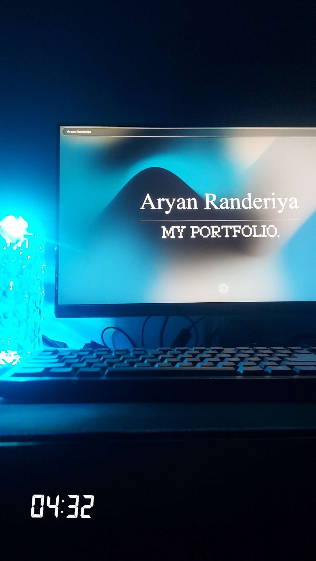
The stack was pure vanilla: HTML, CSS, JavaScript. I was learning JS by building this thing and honestly that felt like the whole point. I pulled in GSAP for animations. I started using Tailwind midway through but already had a ton of vanilla CSS written by then, so the codebase ended up as this chaotic mix of both, Tailwind classes and handwritten CSS just coexisting in a weird way. I hooked it up to Firebase as a realtime database and Cloud Storage for my projects, which was a genuinely terrible decision. The latency was awful, sometimes several seconds to load a handful of project entries. I eventually gave up on that and just dumped everything into a JSON file.
The aesthetic I was going for was… a lot. I was adding all and any style of animation I could find — scroll animations, hover animations, entrance sequences, cursor effects. I think I was going for a maximalist aesthetic and I was just really really into it. But for a freelance portfolio it actually worked really well. Clients would look at it and immediately understand I cared about craft. That was really the whole point.
The problem was I couldn’t stop. I worked on it for over three months straight, sometimes day and night, and even after that I just kept coming back. A transition here, a font size there, a color I wasn’t happy with. I genuinely couldn’t be satisfied. I worked on this website for over a year because I just wasn’t satisfied with how it was, and I just kept fine-tuning the little things over and over until I was utterly exhausted. Here’s my contribution activity while I worked on it:
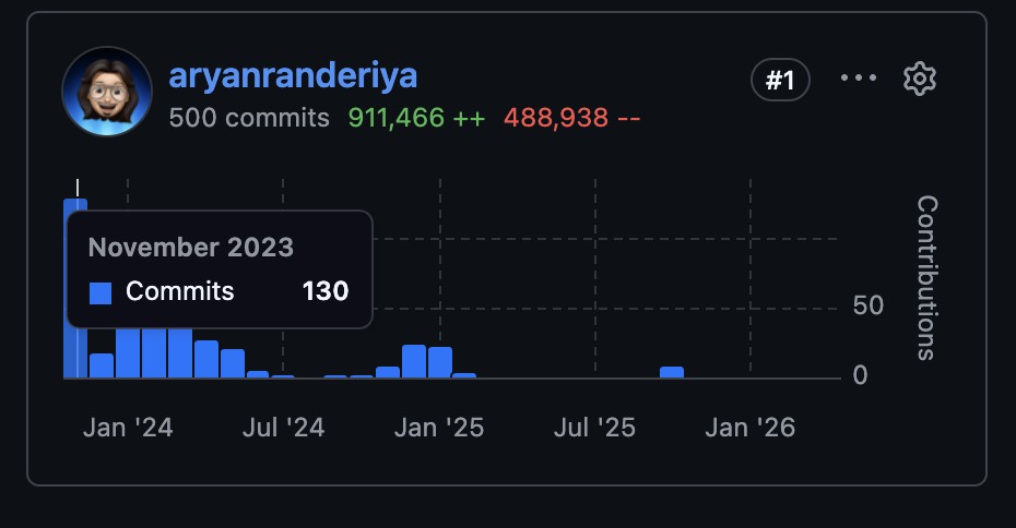
Over a year of tiny adjustments. Looking at that now is kind of funny, there’s a whole chapter of my life packed in there.
The detour
By 2024 I started thinking about doing a blog too. Not just the portfolio, a real place to write things.
So I built one in Next.js: github.com/aryanranderiya/Blog-Next.js
Then I got bored of Next.js, found Astro, thought it was pretty sick, and rebuilt the whole thing in Astro: github.com/aryanranderiya/blog
I never posted a single thing on either of them. lol
The bookmark rabbit hole
In between all of this, I’d been quietly building a collection. Anytime I came across a portfolio from a designer or engineer that genuinely made me stop and pay attention, I’d save it. I ended up bookmarking a shitton of design engineer portfolios that I wanted to take inspiration from. The list grew until it was over fifty sites long.
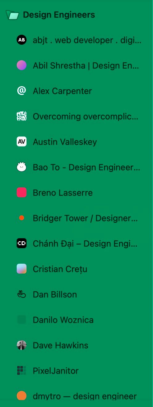
Here are all of them, because I think they deserve the traffic:
abjt.dev · abilshr.com · alexcarpenter.me · molefrog.com · austinvalleskey.com · baothiento.com · brenolasserre.com · bridger.to · chanhdai.com · cretu.dev · dnbls.com · danilowoz.com · davehawkins.co · pixeljanitor.com · pqoqubbw.dev · dmytro.fyi · evangeline.design · evilrabbit.com · floriankiem.com · legions.dev · gxuri.in · henryheffernan.com · bedes.qui.gg · jamesbaduor.com · jhey.dev · jimraptis.com · jimmyl.ee · joebell.studio · pham.codes · joshuawolk.com · lochieaxon.com · baytas.net · hello-mat.com · matthewmorek.com · mery.codes · micah.sh · mikeharmer.com · moumen.dev · natt.sh · preetsuthar.me · raminrzdh.com · raphaelsalaja.com · rauno.me · rene.wang · rpavlini.com · samuelkraft.com · saurabhdaswant.com · smintfy.com · sorenblank.com · tikhon.io · vaunb.lu · over-stimulated.com
The ones I kept going back to most were paco.me for that variable font weight hover effect (still one of my favourite micro-interactions on the web), emilkowal.ski for how Emil uses spacing and that off-white background, and agentation.com for the fixed left sidebar pattern which I just straight up took for this site.
Starting fresh with Linear
When I finally decided to rebuild properly, I started in Linear and not in code. I created a project and just brain-dumped everything I wanted to build. It’s a habit I picked up from working on GAIA, you write it all down first so you’re not inventing scope in the middle of a build and calling it progress.
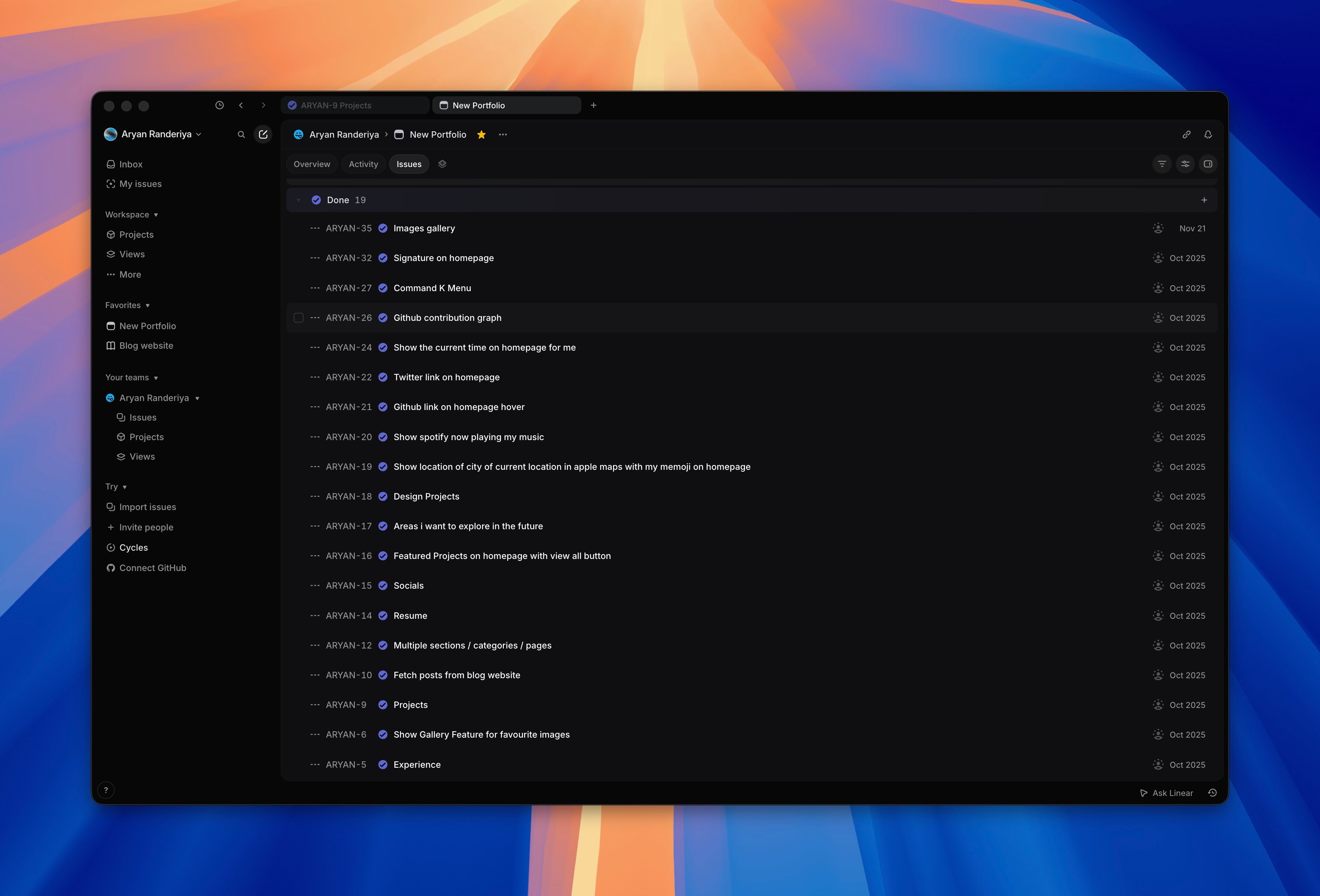
Things I’ve shipped so far:
- Spotify now playing widget (with a live Cloudflare Function to proxy the API)
- GitHub contribution graph
- Location widget showing my city with my Memoji
- Signature on the homepage
- Command-K menu with real navigation actions
- Featured projects with hover preview link cards (OG metadata baked at build time)
- Projects page with a clean single-line list layout
- Gallery page
- Resume page
- Design projects section
- Blog with MDX, a lightbox, shared GitHub graph caching
- WebPets — a little dog that follows your cursor, and you can change the breed
- Colophon page
Still in the backlog (there’s a lot):
- Bookshelf
- Movies watchlist with reviews and IMDB ratings
- A food section with photos and descriptions of things I’ve cooked
- My favourite designed products and apps
- Gesture navigation
- Figma-style custom cursor
- Something with my saved Pinterest widgets
The new build
Initial commit: February 28, 2026. Stack: Astro 5, React 19, TailwindCSS 4, Framer Motion.
I borrowed the Astro project structure from the old never-shipped blog and started from there. The philosophy this time was completely different. The old portfolio was a freelance portfolio trying to win jobs from clients who might spend thirty seconds looking at it, so it needed to be loud and impressive and throw everything at you. This one I wanted to feel more like a founder made it, someone who cares about design but doesn’t need to prove it loudly. I’m not freelancing anymore, I’m building a startup, and the kind of people I want to connect with aren’t going to be won over by scroll animations and cursor trails.
I also wanted this to be more than a portfolio. I sort of wanted it to be my digital universe — my projects, my blog, a gallery, a bookshelf, movies — just my little cozy space to call home on the internet. Somewhere you can actually get a feel for who I am, what I’m working on, what I’m reading, what I’m listening to right now.
Going through all those bookmarked portfolios really shaped how I thought about this. Every site I actually loved was narrow, like 640px max or thereabouts, never wider. Body text was always smaller than I expected, more like 13-14px rather than the default 16px that every framework spits out. Flat design everywhere — no card borders, no outlines on chips, just background fills doing the separation work. And sidebars instead of top navs. I ended up stealing the agentation.com sidebar pattern directly, fixed left sidebar, totally transparent, no background or border, just links floating on the left of the page.
For animations I went heavy on Framer Motion but tried to make everything feel intentional. Blur-fade entrances rather than just opacity fades, staggered list items, spring easing. I really wanted the motion to feel physical and not mechanical.
For deployment I tried GitHub Pages first because it’s free and it’s just a git push. Turned out my GitHub account was banned from creating new resources because of an unpaid Copilot invoice from a few months earlier that I’d somehow missed. Could not deploy a static site from a banned account. lol. So Cloudflare Pages it was, which honestly turned out to be the better choice anyway. The Spotify now playing widget needs a server-side proxy because Spotify’s API has CORS restrictions and you can’t expose the credentials client-side, and Cloudflare Functions let me colocate that alongside the static site in the same deployment without setting up a separate backend.
The little details
A bunch of small features I’m disproportionately proud of.
WebPets. A little animal that follows your cursor around the entire viewport. Click the launcher in the bottom-right and you get a popover grid of twenty-two sprites to pick from. There’s a dog (the default), a dinosaur, a panda, chickens, a frog, a bunch more. The default is randomized between dog, dino, and panda on first visit and the choice persists to localStorage. The cursor-follow pauses while the popover is open via a pausedRef that the animation loop checks every frame, so opening the popover doesn’t restart the animation. Built on top of webpets by Sankalpa Acharya.
Preview link cards. Hover any inline link to a project or another site and a portalled card appears with the OG image, favicon, title, and description. The metadata is fetched once at build time, so there’s no flicker on hover and no extra request at runtime. Pattern borrowed from the GAIA web app’s CustomAnchor.
Progressive images. Every image in the projects grid and design gallery loads with a thumbhash blur. It’s a 25-byte string baked into the project frontmatter, decoded client-side onto a tiny canvas, then crossfaded into the real image when it loads. Skeletons feel like loading states. Thumbhashes feel like images getting sharper.
An archive of agent conversations
There’s a section of the site called Agent Conversations which is a curated archive of seventeen real coding sessions I’ve done with AI agents, mostly Claude Code and Codex. The kind of session where something genuinely novel happens. An agent that runs autonomously overnight and finishes a Remotion video while I sleep. Four subagents spawning in parallel to inspect a UI before rebuilding it. A credential boundary bug traced through three layers of CI infrastructure. A self-analyzing skill creation loop. That kind of thing.
Each entry has structured metadata baked into the frontmatter — token count, message count, duration, files changed, lines added and deleted, model used, harness version, agent count, branch. The list page renders them sortable by date with featured ones pinned to the top, and each entry’s detail page reads like a short essay about what the agent actually did and why it was interesting.
The meta part: I didn’t write any of these myself. I have a Claude Code skill called log-convo that I run after a particularly impressive session. It points Claude at the raw conversation transcript, asks it to analyze the session, extract the genuinely surprising bits, calculate the metadata from the JSONL, and produce a complete MDX entry in the right format. So the archive is essentially an AI-written history of working with AI, which I find funny and slightly unsettling depending on the day.
It’s the closest thing I have to a “now playing” widget for how I actually work in 2026. Most of my interesting engineering happens in conversations with agents now, and this is a way to make that visible without it being weird LinkedIn-thoughtleader content.
Squeezing it down
Performance got the same treatment a few weeks after launch. Initial Lighthouse scores on the home page were in the high seventies, which felt embarrassing for a static site that’s mostly markdown and a few images.
The wins, in roughly the order I shipped them:
- Lazy-loading AIChat. I’d been bundling an experimental in-page AI chat into the initial JS load, and it pulls in WebLLM, which is roughly 6 MB of WASM. Moved it behind a dynamic
import()triggered by the open button. That alone bumped the perf score by twenty-something points. client:idletoclient:visiblefor grid components.ProjectsGrid,GithubGraph, and the design gallery were allclient:idle, which fires onrequestIdleCallback. That meant they hydrated even if you never scrolled to them. Switched toclient:visible(intersection observer) so they only hydrate when they actually enter the viewport.- WebP everything. Avatars, flags, book covers, the Spotify logo. The Spotify logo went from 49 KB PNG to 4 KB WebP without any visible quality loss.
width/heightplusfetchpriority="high"on LCP images. Removed CLS from the hero and gave the LCP image a head start in the network queue.- Font split with
unicode-range. Inter Variable is split into two woff2 files, one for latin and one for latin-extended. The browser only downloads the extended file if a glyph in that range actually renders, which on most pages it doesn’t. font-display: optionalinstead ofswap. Stops fonts from swapping in mid-render and shifting layout. If the font isn’t ready in 100 ms, the page renders in fallback and the font is cached for the next visit. Editorial layouts care about this more than most.- Killing Google’s favicon API. I was using
s2/favicons?domain=...to render favicons in the socials and tools rows. That request set ten third-party tracking cookies (GRECAPTCHA, COMPASS, OSID, others) and counted against Lighthouse Best Practices. Wrote a small Python script that downloads favicons for all twenty domains via DuckDuckGo’s API, converts ICO to PNG with Pillow, and caches them inpublic/icons/favicons/at build time. Zero third-party requests on page load now.
There was one mid-debug surprise that took an embarrassing amount of time to track down. I’d wrapped the Inter font import in @layer(utilities) to make it non-blocking, and that flipped Tailwind v4’s layer precedence. Because @layer(utilities) was now declared before Tailwind’s own layers, every Tailwind utility class started losing to base resets. Half the site silently broke until I noticed display, width, height weren’t applying anywhere. Reverted to a plain @import and ate the small render-blocking cost.
Accessibility got the same pass at the same time. Final scores landed at 100 / 100 / 100 / 100 across performance, accessibility, best practices, and SEO. The accessibility wins were mostly contrast: --text-muted was at rgba(0,0,0,0.35) which fails WCAG against the warm off-white background. Bumped it to 0.54 and did the same for sidebar nav links and section labels. A couple of ARIA fixes (a role="img" on the signature SVG container, a few missing favicons that 404’d in the manifest), and that was it.
I ran the same exercise on the GAIA landing page, which started at 34 and ended at 100. Different stack (Next.js, not Astro), different bottlenecks (forced reflows, Sentry on the critical path), but the same general shape: profile honestly, fix the worst thing first, refuse to ship visual regressions to make the score look better.
Chasing a flash
A few days after launch I noticed something annoying. Click any sidebar link and the cursor would flicker from pointer to default and back to pointer in the space of about a frame. The bottom-of-page blur layer would also flash on every navigation, like the page was doing a hard reload even though I had Astro view transitions on. Both things were small enough to ignore and big enough to make the site feel cheap.
My first guess was the sidebar React component was re-rendering on every navigation. I had a listener that updated pathname in a useState whenever Astro fired its page-load event, which meant a full re-render of the sidebar tree mid-swap. So I rewrote it to skip React entirely on navigation — track the pathname in a useRef and toggle the active class on the <a> tags by hand from the listener. Tested it, felt good about it. Still flashed.
That’s when I gave up trying to reason about it and just installed react-scan so I could actually see what was re-rendering. For Astro you just drop the script in the <head> before any island hydrates:
{import.meta.env.DEV && (
  <script
    is:inline
    crossorigin="anonymous"
    src="https://unpkg.com/react-scan/dist/auto.global.js"
  />
)}
Refresh, click a sidebar link, and the bottom blur lit up bright red. So did the entire sidebar. So did the new page content (which was fine, that one’s actually new). Two things confirmed at once: my sidebar fix wasn’t working, and the bottom blur was getting torn down on every navigation.
I went back to the Astro view-transitions docs, which I had clearly skimmed the first time, and found two details I’d missed:
- The
<ViewTransitions />component has been renamed to<ClientRouter />in Astro 5. They behave the same but I figured if I’m going to fix this I might as well move to the current API. transition:persistkeeps the DOM and the React state, but the component still re-renders with new props by default. There’s a separate directive,transition:persist-props, that freezes the props at first mount.
That second one is the whole bug. My sidebar had transition:persist, so the DOM survived navigation. But Astro was re-passing pathname={Astro.url.pathname} from each new page to the persisted island, and React happily re-ran the whole component every time the prop changed. The DOM mutation inside my listener was working fine — it was just being stomped by the React render that fired right after.
The bottom blur was a different version of the same problem. It lived in the root layout, but it had no transition:persist at all, so Astro’s swap was deleting it and rebuilding it on every navigation. Same for the command palette, the cursor pet, and the agentation overlay — all decorative chrome that should sit perfectly still while pages swap underneath them.
I added transition:persist plus transition:persist-props to every chrome island, ran the dev server, and the flash was gone everywhere. Or so I thought.
The second bug
A few minutes later I navigated from /projects to /projects/some-slug and the entire sidebar re-animated from blur into focus, like it was mounting for the first time. The bottom blur flashed too. Only on this one route. Blog post pages were fine. The home page was fine. Just project detail pages.
react-scan confirmed what I was seeing: the sidebar was unmounting and remounting between those two pages. Why?
The Astro docs say auto-generated transition:persist keys are usually fine and you only need to name them explicitly when “elements differ between pages.” It turns out the elements don’t have to differ for the keys to drift — the islands around them are enough. The projects index has a ProjectsGrid and a GithubGraph rendered inside PageLayout. The slug page has neither. When the island count inside the layout changes between two pages, Astro’s auto-generated persist keys for the chrome shift, and the matcher gives up and remounts everything.
Fix is anticlimactic. Give every persisted island a stable string name:
<!-- Layout.astro -->
<Preloader         client:load transition:persist="preloader"  transition:persist-props />
<BlurStack         client:idle transition:persist="blurstack" />
<CommandK          client:idle transition:persist="commandk"   transition:persist-props />
<PetLauncher       client:idle transition:persist="petlauncher" transition:persist-props />
<AgentationOverlay client:idle transition:persist="agentation" transition:persist-props />

<!-- PageLayout.astro -->
<Sidebar
  pathname={Astro.url.pathname}
  section={section}
  client:load
  transition:persist="sidebar"
  transition:persist-props
/>
Reload, open react-scan, click around. Nothing in the chrome lights up on any route. Sidebar entrance animation only plays on the very first page load. Cursor stays a pointer through every click.
Two takeaways I want to remember next time. First: I spent a lot of time reasoning about which React state was changing and whether Framer Motion was re-evaluating variants, and the answer was sitting in framework docs I hadn’t finished reading. Second: a tool that visualises re-renders is worth more than any amount of staring at a component tree. I’d been telling myself for years I should set up react-scan or why-did-you-render, and the entire setup for this project ended up being one script tag.
Where it’s at now
I still have a lot to build. The backlog is long, the todo list honestly grows faster than I ship things off it, and I’m still not entirely satisfied with how parts of it feel. But I think that’s probably just how it goes when you care about something, you just keep wanting to make it better.
What I’m really happy about is that it actually feels like mine now. Every photo in the gallery is something I actually care about. The Spotify widget is showing you what I’m genuinely listening to at this very moment. The blog is for things I actually want to write about, not performing expertise or doing thought leadership. It’s just a place that reflects what I’m into and what I’m doing.
I’ve been working on this for three years across three different codebases and I’m still not done. Some things never change I guess.