Minimalistic color-coded note-taking app with a clean interface for organizing thoughts and ideas.
I won a PS5 in a hackathon bcz of this project!!
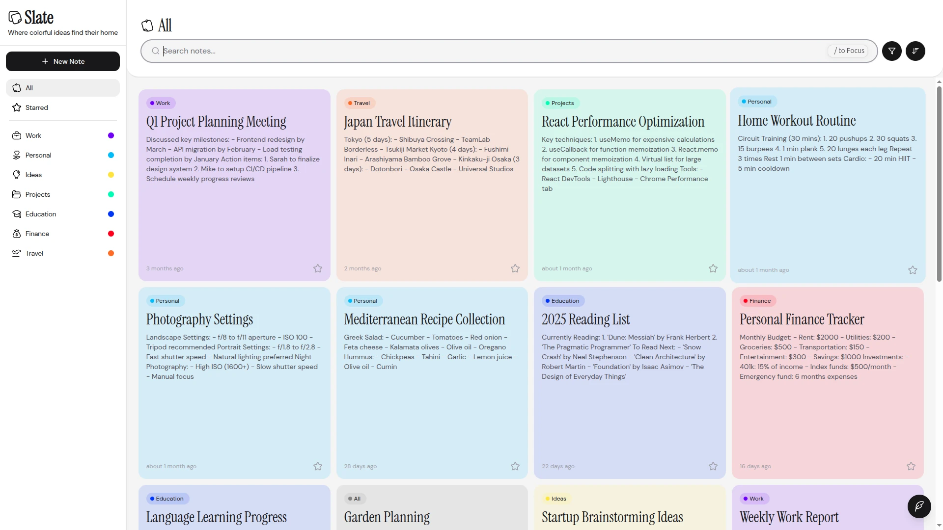
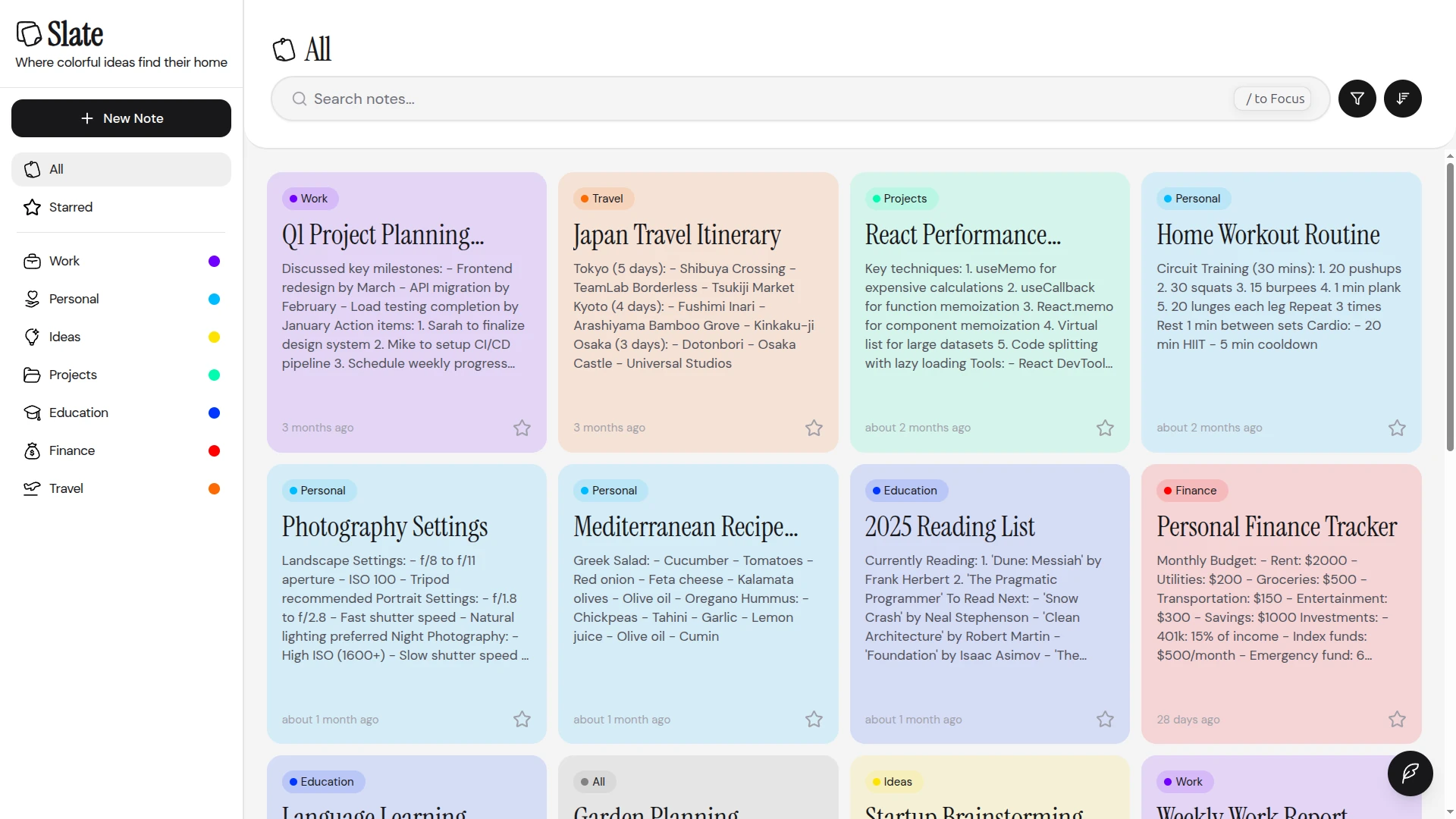
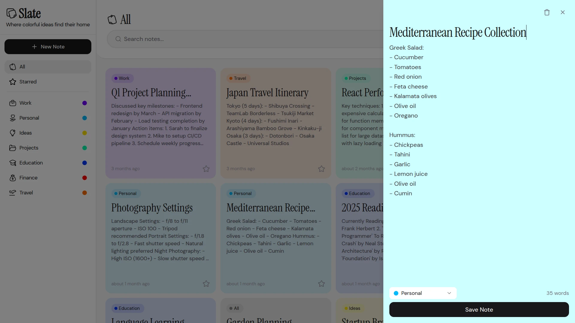
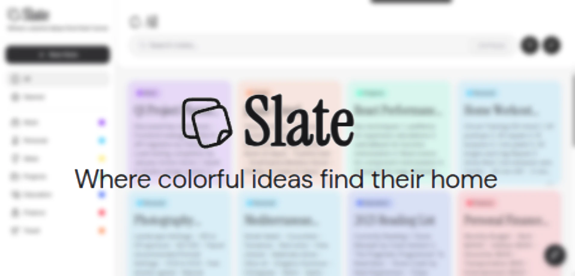
I built Slate for a Frontend UI Hackathon hosted by Outlier.ai, and the core idea was simple: every note deserves a color. The app assigns each note a pastel tone - pink, green, purple, blue - and that color system becomes the organizing principle of the entire interface. It’s not just decoration; the colors make it instantly easy to scan and differentiate content at a glance.
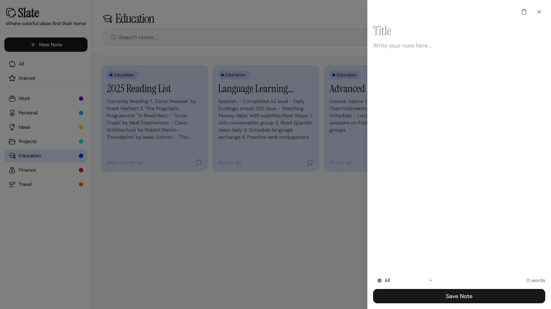
The sidebar holds three content types - notes, todos, and bookmarks - keeping everything in one place without feeling cluttered. The main area renders content as soft, colored cards that feel more like sticky notes on a desk than rows in a database. I wanted the experience of opening the app to feel genuinely pleasant rather than functional-but-forgettable, which guided every layout and spacing decision.
Most note-taking tools lean heavily utilitarian - dense, monochrome, and built around structure over feeling. I deliberately went the other direction with Slate, using a light and airy aesthetic with generous whitespace and pastel tones to make the app feel inviting.
The stack was Next.js 15 with TypeScript and TailwindCSS, with HeroUI and Radix UI handling the component layer and Framer Motion powering the animations. That combination gave me the speed to iterate quickly on the UI during the hackathon window without sacrificing the motion and polish that made the experience feel finished.
The judges seemed to agree with the approach - I took home a PS5 for this one. It was a good reminder that in frontend work, the feeling a product gives you matters just as much as what it technically does.